Your website is not a brochure. It’s a 24/7 sales engine—if it’s built like one.
In every industry that has undergone digital transformation—fitness, hospitality, healthcare, food service—the moment of truth shifted from the physical front door to the digital one. The shooting range industry is in that moment right now. A prospective customer’s first interaction with your range is almost certainly not a phone call or a walk-in. It is a Google search, a tap on their phone, and a five-second judgment of your website. If what they see doesn’t immediately communicate trust, clarity, and a frictionless path to action, they are gone. Not to your competitor’s website—to their couch, where the decision to visit a range dies quietly.
The data on this behavior is unambiguous. A 2025 Tooltester study analyzing over four billion web visits found that 68.2% of all website sessions now originate from mobile devices. Shopify’s 2024 eCommerce data showed smartphones accounting for roughly 78% of retail site visits globally. And Google’s research consistently shows that 53% of mobile visitors will abandon a site that takes longer than three seconds to load. For an industry where many websites still feature PDF menus, auto-playing videos, and booking processes that require a phone call, these numbers represent both a diagnosis and a prescription.
The Three-Click Rule (and Why It Matters More Than Your Logo)
Here is a principle borrowed from hospitality and SaaS that applies directly to your range: if a visitor cannot book a lane, sign up for a class, or purchase a membership within three clicks of landing on your site, you are losing revenue. Every additional step in the conversion path introduces friction, and friction compounds. CRO benchmarks from 2025 show that conversion rates drop by an average of 4.42% for each additional second of load time. Landing pages with a single, focused call-to-action convert at dramatically higher rates than pages cluttered with competing options.
This does not mean your website needs to be minimalist. It means your website needs to be intentional. Every page should have a clear primary action, and the path to that action should feel effortless—especially on a phone screen being operated with one thumb.
Think about how Orangetheory Fitness or ClassPass handles their digital front door. You land on the homepage. Within seconds, you understand the value proposition. One prominent button says “Book Your First Class.” The entire experience is designed to move you from interest to action with minimal cognitive load. Now visit the average shooting range website. You might find the hours. You might find a pricing PDF. You will almost certainly not find a way to book a lane in three clicks. That gap is where revenue goes to die.
Understanding Who Is Actually on Your Site
Before you restructure a single page, you need to understand who is visiting and what they are trying to accomplish. Your website serves at least four distinct visitor personas, each with different intent and different tolerance for friction.
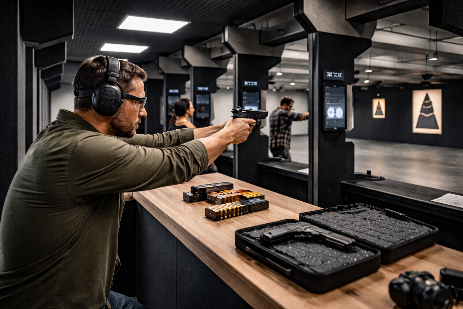
The First-Time Shooter is nervous, information-hungry, and safety-conscious. They want to know: Is this place beginner-friendly? What do I need to bring? Will someone help me? They are scanning for welcoming language, clear safety information, and introductory class options. If your homepage leads with tactical imagery and assumes range familiarity, you have lost this visitor before they scroll. This audience is growing fast—with an estimated 3.9 million Americans becoming first-time gun owners in 2024 alone and female firearm ownership up 177% since 1993, the first-time visitor may be your single largest growth segment.
The Experienced Shooter already knows what they want. They are looking for range specs, lane availability, pricing, and membership details. They have low patience for marketing copy and high expectations for functional information. This visitor needs clean navigation and fast access to the specifics.
The Event Planner is researching group experiences—corporate team-building, birthday parties, bachelor events. They want package details, pricing tiers, photos from past events, and an easy way to request a quote. A dedicated “Group Events” page with strong social proof is essential for this persona. [See our companion article: Attracting Corporate Events & Private Parties]
The Comparison Shopper has your tab open alongside two or three other ranges. They are evaluating on the basis of trust signals: reviews, photos, staff credentials, facility quality, and—critically—how professional your digital presence feels. Research shows that 87% of consumers will pay more for brands they trust. Your website is where that trust either begins or doesn’t.
The Pages Your Site Must Have (and What Each One Needs to Do)
A high-converting range website is not about having the most pages. It is about having the right pages, each designed around a specific visitor intent and a clear conversion goal.
Homepage: Your Five-Second Pitch
Your homepage has approximately five seconds to communicate three things: what you are (a shooting range), what makes you different (your brand position), and what the visitor should do next (your primary CTA). The most effective range homepages feature a clear headline, a sub-headline that speaks to the visitor’s motivation (safety, fun, training, community), and a prominent action button—“Book Your Lane,” “Try Your First Class,” or “Explore Memberships.” Below the fold, support with trust signals: customer reviews, certification badges, and authentic facility photos. Avoid auto-playing video, rotating carousels (which dilute focus), and any element that slows load time.
Range Info & Pricing: Kill the PDF
If your pricing lives in a downloadable PDF, you are creating unnecessary friction and making your content invisible to search engines. Pricing, hours, lane types, rental options, and safety requirements should all be directly on the page—structured, scannable, and mobile-friendly. This is also where you address the first-timer’s anxiety: a short FAQ section answering “What do I need to bring?” “Do I need my own firearm?” and “Is instruction included?” can reduce bounce rates significantly.
Classes & Training: Where Conversion Meets Content
Your training page is simultaneously a content marketing asset (great for SEO) and a conversion page (great for revenue). Each class should have its own section with a description, instructor credentials, schedule, pricing, and a booking link. The booking link is non-negotiable. If a visitor reads a compelling class description and then has to call to register, you have broken the conversion chain at the moment of highest intent.
Memberships: Good, Better, Best
Present your membership tiers side-by-side with a clear visual comparison of features and pricing. Highlight the most popular option (the “Best” tier) with a visual differentiator—a badge, a color change, a “Most Popular” label. Include a cost-savings calculator or a simple line like “Members save an average of $80/month.” The conversion goal is a “Join Now” button that links directly to a signup form, not a “Contact Us” page. [See our companion article: Membership Sales & Upgrades]
Group Events & Parties: Sell the Experience
This page needs to work harder than any other because event planners are comparison shopping and often booking weeks in advance. Lead with photos from real events (with permission). Present tiered packages (budget to premium). Include testimonials from corporate clients and social hosts. Make the inquiry form short—name, date, group size, and contact info—and follow up within 24 hours. Faster response times directly correlate with booking conversion rates across every service industry.
Contact & Location: Reduce Every Possible Friction Point
Embed a Google Map. Display hours prominently. Make the phone number tap-to-call on mobile. Include a physical address that matches your Google Business Profile exactly (this matters for local SEO). If you have a contact form, keep it to four fields or fewer—every additional field reduces completion rates.
Mobile-First Is Not a Suggestion—It’s a Revenue Decision
When nearly seven out of ten website visits come from a mobile device, designing for desktop first and “making it responsive” for mobile is building your business backwards. A 2025 analysis of over four billion web visits found that mobile sessions had the highest bounce rate at 35.9% compared to 31.6% on desktop—and that mobile pages take an average of 70% longer to load than their desktop counterparts. Every second of that delay costs you customers.
The mobile experience must deliver three things. First, speed: your site must load in under three seconds on a cellular connection. Test with Google PageSpeed Insights and GTmetrix, and treat any score below 80 as a business problem, not a technical one. Second, tap-friendly navigation: buttons large enough to hit with a thumb, menus that don’t require precision, and booking forms that work without a keyboard. Third, click-to-action functionality: tap-to-call, tap-to-book, tap-to-get-directions. If a mobile visitor has to pinch, zoom, or copy-paste a phone number, your site is costing you bookings.
Conversion rate data from 2025 confirms the stakes: mobile conversion rates average 1.3–2% across industries compared to 2.5–3.5% on desktop. That gap is not inherent—it is the result of poor mobile execution. The ranges that close the mobile conversion gap are the ones investing in mobile-first design, not desktop-first “responsive” retrofitting.
CTAs That Drive Action, Not Just Clicks
A call-to-action is only effective if it is specific, visible, and relevant to the visitor’s intent at that point in the page. Landing pages with a single CTA convert at dramatically higher rates than those with competing options. Apply this principle across your site.
Placement matters: Your primary CTA belongs above the fold (visible without scrolling), repeated mid-page, and reinforced at the bottom. On mobile, a sticky “Book Now” button that follows the visitor as they scroll can meaningfully increase conversion.
Language matters: “Book Your Lane” outperforms “Contact Us.” “Try Your First Class — $25” outperforms “Learn More.” Specificity reduces uncertainty, and reduced uncertainty increases action. For first-time visitors, consider CTAs that lower the commitment bar: “Take a Tour,” “See Our Beginner Guide,” or “Watch a Range Walkthrough.”
Trust signals near CTAs: Place customer reviews, safety certifications, or a staff photo near your booking button. The 2025 Edelman Trust Barometer found that consumers trust brands more than any traditional institution—but that trust is built through consistency and transparency at every touchpoint. A five-star review next to a “Book Now” button is not decoration; it is a conversion tool.
Visuals That Build Confidence, Not Just Aesthetics
The images on your website do more than fill space—they set expectations and signal who your range is for. If every photo shows tactical operators in full gear, you are telling first-time shooters, women, and families that this place is not for them. If every photo shows smiling families and no actual shooting, you are telling experienced shooters that you are not serious. Your visuals must align with your brand position [See: Build a Brand, Not Just a Business] and reflect the actual diversity of your customer base.
Use real photos of real customers (with permission), real staff, and real facilities. Professional photography is an investment that pays for itself many times over in conversion rates. Include video where possible—a 60-second range walkthrough, a class preview, or an instructor introduction. Video builds familiarity and reduces the anxiety barrier that prevents first-time visitors from booking.
Tracking What Matters: Your Website as a Data Source
A high-converting website is not built once—it is continuously improved through data. Install Google Analytics 4 and configure it to track the actions that matter: booking button clicks, membership signups, class registrations, and contact form submissions. These are your micro-conversions, and they tell you exactly where visitors are engaging and where they are dropping off.
Layer in heatmap tools like Hotjar or Microsoft Clarity (which is free) to visualize where visitors click, how far they scroll, and where they hesitate. The combination of quantitative analytics and qualitative heatmap data gives you the insight to make evidence-based design decisions rather than guessing. [See our companion article: Analytics for Range Owners: What to Measure & Why It Matters]
Review this data monthly. The ranges that treat their website as a living, optimized asset—not a set-it-and-forget-it brochure—consistently outperform their competitors in both traffic and conversion.
Your Website Is Either Booking or Blocking
In every service industry that has moved through its digital transformation—from fitness studios to dental practices to restaurants—the operators who invested in their digital front door gained a compounding advantage over those who treated their website as an afterthought. The shooting range industry is in this window right now.
Your website does not need to be the most expensive or the most visually complex site in your market. It needs to be fast, clear, mobile-first, and relentlessly focused on moving visitors from interest to action. It needs to answer the questions your customers are asking, reflect the brand you are building, and connect directly to the booking, membership, and CRM systems that turn clicks into revenue. The ranges that get this right will book lanes, sell memberships, and fill classes while their competitors are still answering voicemails.
Your range is ready. Make sure your website is, too. Build something that books while you sleep.